Transition Update and a Photo Challenge
Unfortunately, during the last week or so, while I wasn’t on top of the Block Lotto Blog, I ALSO wasn’t working on our new site …
I’m a little embarrassed to admit that I’m still fighting with the template and the Home page format. I’m currently impatiently waiting for “support.” I’d like to pull it together in the next few days, but I don’t think it’s going to happen. There has been a lot of “one step forward, two steps back;” I’m sure there will be more of the same; and, at the moment, I’m stuck 😉
One of the view things that is sort-of working is a photo-slider feature on the home page, in which I’d like to feature photos of the quilts and other projects made from lotto blocks OR inspired by lotto blocks. At the moment it’s having problems auto-magically resizing the images on posts imported from here. So, I was thinking that some of you might be interested in creating “beauty shots” of your beautiful quilts in the preferred dimensions:
960 pixels wide x 368 pixels tall
I know that a lot of our quilts have been gifted or donated. If that’s the case, another option could be to crop one of your existing photos (or create a collage of photos) which is approximately 2 1/2 times as wide as it is tall. Otherwise, after I manually tweak your posts with photos so that they WILL be cropped/ re-sized automatically, we’ll have no artistic input into HOW they will be changed to fit.
If you have the time and inclination to re-photograph a quilt or crop/collage exisitng photos to create something with the ideal proportions for the “slider,” you can email them to me and I’ll glue it all together 😉
UPDATE
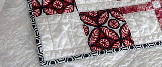
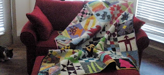
I cropped a couple photos to see if that slider would work as expected. (Andrew, I hope it’s OK with you that I took some liberties with yours).
They are both close to the 1: 2.5 ratio. They look the same size here. but the detail photo of Andrew’s quilt is actually much smaller than the ideal size of 960 pixels wide x 368 pixels tall. The other photo is slightly larger. If you click over to our future home page, and wait for them to “slide” by, you can see what happens. I also created a “beauty crop” of a detail of Julie’s wonderful quilt made from the combination of string hearts and violet blocks and a couple of other recent “show and tell” posts.
IF you follow the home page link and go check out the current sad state of the construction project going on in our new home, PLEASE DO NOT attempt to post or add comments . . YET.


For anyone who is interested, here is a link to instructions on how to resize your pictures using Microsoft Paint.
http://windows.microsoft.com/en-US/windows7/Resize-a-picture-using-Paint
Oh, also, I would suggest using the dimensions of 368 pixels tall and letting Paint automatically determine how wide your picture should be to maintain the aspect ratio so the picture doesn't turn out streched. (that is as long as Sophie doesn't mind if pictures aren't exactly 960 x 368)
I think that if we get CLOSE to the proportions, then we won't have to worry about any photos getting automatically cropped or stretched in some unattractive way.
Again, this exercise is completely voluntary. I just thought it would be fun to have some beauty shots of the beautiful quilts you have made, front and center, on the new site.
The new page looks good to me! Change is difficult and computer changes are even more so. Be kind to yourself. =)
Susan, you just remember that good advice when you all are making this transition WITH me soon 😉
I am making baby steps toward getting us there and we'll move when it's "good enough" if not completely completed 😉