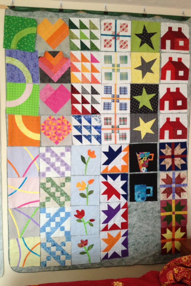
2013 Sampler
Started this sampler in 2013. Each month I made 4 extra for my sampler. Except for the flowers all follow the guidelines. I have 2 more mugs to finish before I sew them together but I am starting to think about placement. Don’t really want to use sashing because I was hoping for a smaller quilt. Goal is to finish this before the month is out. Any suggestions for placement?
Helen
Nashville, TN


I am so tempted to pull your photo into photoshop and cut it up and rearrange it … but ’tis the season when none of us have any extra time. One layout that I’d consider is putting putting the 4 blocks of each pattern together into big 18 inch blocks and then adding sashing (and maybe cornerstones) for a traditional sampler layout. Another idea is to put the 4 Eclipse blocks together to form a circle and starting with that in the center, lay out the rest of the blocks in a symmetrical arrangement around it.
One of the suggestions that someone (Andrew, I think) had for me was that I should choose colors for 2015 such that if someone made extra blocks like yours that they would be assured of playing well together in a quilt … and not be so challenging as your blocks 🙂
Helen these are so exciting…I wasn’t a member that year so it is really exciting to see the independent arrangement of block groupings. I am not experienced enough to comment on your question but, I will be eager to see what you decide on! Happy Sewing!
I like all the blocks and do think they get along with each other well. I also like Sophie’s idea of sewing each four grouping into large blocks. Maybe you can place them that way on the design wall, and re-post a picture for us?!
I like them the way they are – don’t need sashing or border. Great sampler, Helen. Merry Christmas!
I love all these blocks! My first thought was grouping the directional blocks together (the HST’s, stars, circles, jacob’s ladder) into 2×2 big blocks. But wasn’t sure what to do next. Then I looked at Dena’s post on the Big O modules and wondered if there wasn’t a way to use that type of layout. One other thought was putting all the “dark blocks” as a big group and the light blocks framing them. (color background vs. light background) Sophie is right, it would be fun to print these out and play that way!